Sunday, April 25, 2010

Liquid Book


CONTROLLING NATURE: APRIL 2005
This bookwork studies how “control, “construction” and “natural inspiration” create a book form. Water as the essence of life, as an element that flows with no distinct start or stop, became the motivation behind creating a book which would be infinitely malleable. Getting its cues from nature, the book interprets the idea of control through the flowing ink which reveals and conceals the text underneath. The inner form is constantly changing and will never be the same twice. Time changes the piece. With his interaction, the reader changes the work and discovers the world hidden underneath.

Layered Paper


WEAVING HALLEY: APRIL 2005
These two posters for Peter Halley translate the artist’s design vocabulary and usage of color as structure within the investigation of type as image. They are constructed out of a pixel typeface which was cut out of brightly colored paper. Each letter of his name—PETER HALLEY—was cut out from a single sheet. The sheets were then stacked on top of each other and shifted around to create a woven series of color combinations. The vibrant color became the structure organizing the poster space. A secondary layer of typewas added to the surface of the page—the same typeface only smaller and more recognizable.

Resulting from the intense saturation and optical vibration of simultaneous contrasts, the color creates a dimensional space out of flat paper pieces. The foreground and background continually shift spatial positions due to the reverberation of optical illusions. One poster organizes the typography around an empty center to represent Halley’s Conduit paintings. The other poster has a more ambiguous structure and similar size elements which creates a more woven space.

DieCut Book


MISSING WORDS: MAY 2005
For this bookwork, I utilized cut digital letterforms to translate Mark Strand’s poem. The sixteen pages spell out the phrase “I AM WHAT IS MISSING.” The missing counterforms become the content for the book. The letterforms are missing from the pages; they become legible only when the page is picked up from the stack, and the void becomes filled in. The solid void relationship creates a series of patterns that changes as the viewer flips the individual pages of the book. Simple words, but their content is all that is necessary to convey the meaning.

Wax Book


This week our assignment was to pick a material and create a project experimenting with the material and its opposite. I became intrigued in working with wax, which was an amazing material that transformed its state. I melted it and then dried it back into a solid. From frozen state I was able to quickly reconfigure it into a liquid, changeable state. Solid turned into liquid turned into solid again—the reaction continued endlessly. This transformation from liquid to solid, as well as the ability to embed objects inside of the material made beeswax as well as candle wax attractive materials for experiment. The wax became a canvas for material collages of various forms.

I had used wax once before, but never fully explored its potential as a material which could create collages with embedded materials. I poured the wax into small “pages” which were meant to be put together into a book work. The books became tactile and sensory experiences. The differently colored and differently combined flat pages constructed three book works with different materials and themes. The exploration evolved into a very hands-on experimental process where I kept adding different found materials into the wax to see what kind of relationships could result within the frozen collages. I combined plastic 3-D letters, flat plastic bags, snippets from a “how to write” English book, threads, leather scraps, and plastic disks into my assemblages.

Layered Book


REORIENTING THE PAGE: APRIL 2006
Variable page sizes and interwoven sheets of acetate makes the quote book a one of a kind object, conscious of its own page space as a dimensional space. Each quote exists on its own separate page and is labeled as a different type of a space: shifting space, copied space, any space, etc. The acetate sheets re-construct the page within the page, creating borders and edges, and a depth of tonal gradation. The bright colors of the pages also add to the dimensionality of the book. As the pages were turned and the layered configurations changed, the book appeared deeper or shallower depending on color contrast.

Flip Book: Car Trip


TOURING THROUGH THE WINDOW: NOV 2005
The flip book conveys the growing horizon. People can play with the pages and flip them at different intervals to construct new juxtapositions. The bookwork is interactive and the horizon becomes the content for exploration. The snapshots out the window are embodied in a flippable book which itself resembles a car window frame.

Flip Book: Word Play


RECONSTRUCTING THE SCENE: NOV 2005
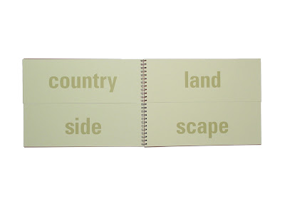
Layering becomes interactive when depth and dimension are added to the book page. The space of a book is changed through cutting away pages. Viewers can look at the book in space through the z axis, not just on the expected x and y dimensions of typical pages. New verbal juxtapositions are constructed through flipping the top and bottom pages at different intervals. The original words describing the plaza scene are compound nouns that can divided into two new stand-alone words: neighborhood, outlook, courtyard, outside, sundown, paintbrush, afternoon, nighttime, outdoor, viewpoint, openair, framework, stilllife, sketchbook, background, cobblestone, tree branch, sunset, landscape, clocktower, oaktree, brushstroke, gaslamp, sunlight, countryside, foothill.

Calendar


Alphabet Book